This is a 2010-to-2013 archive of toki-woki.net. Here's how it looks now.

Fluid Corners, a window UI idea

A few days back a very simple idea struck me right before going to bed. The more I thought about it, the less I could sleep. The day after this short night I fired up Photoshop and started writing a little bit of JavaScript. All this led to Fluid Corners.

The idea is pretty simple but could come in handy: when your OS’s windows are moved off-screen, their essentials UI elements (think: buttons) stay at reach, sticking to the screen’s limit. Go ahead and play with the demo, you’ll get it!

Thoughts welcome, of course.

ps 1: A hot thread about it on Hacker News.
ps 2: @raphaelbastide‘s take on the idea: greasy!

Least, a CSS to LESS tool

A few months back I discovered the concept of CSS pre-processors. At that time I knew about LESS and Sass and had to decide which one was the best option for me. I thought the concept was really cool but lacked a real project to start getting my hands dirty with it.

Then I started working on a freelance project and Crunch came out; I was sold. This app made me choose LESS over Sass, which may not be the best of reasons, but it seems like I’m not the only one to pick this language. As you may know the second iteration of Twitter Bootstrap also relies on LESS, even encouraging you to use Crunch.

Saturday @ilovetypography tweeted this:

Dreaming of something that takes my CSS & LESSifies it — automagically.

To which I replied that:

This seems possible! Will try and see if I can write such a tool, interesting idea…

Sunday morning I started writing JavaScript, and a few hours later I had a good-looking script. Took some time to create a simple yet efficient UI, and that was it. Least.

The tool takes basic CSS as an input and tries its best to output the LESS or Sass source it would correspond to (including nesting, classes and pseudo-classes). I also added an option to output something for the not-so-popular-but-interesting Stylus language.

As you’ll notice in the footer of the tool’s page it’s a “five-hour project”. In order to have a decent UI as fast as possible I used Twitter Bootstrap, which has its downsides but fits perfectly this kind of projects. A “five-hour project” also means it may still be a bit buggy. Don’t hesitate to ping me on Twitter or to drop comments here.

ps: Least both references LESS and “To Say the Very Least”, a track by Buck 65 on Vertex. Ah!

Kwot JS

Remember Kwot, my Flash quote viewer? I published it back in December 2008.

It is a mix of Flash (most part of it), JS (for the add form and its communication with the main UI) and PHP (CRUD logic). Read the blog post for more details on it.

I recently started looking at JavaScript frameworks and tools, probably like most Flash developers. Not because Flash is dead, but because the more tools you master, the better you are. And because yes, everyone is asking for JS and CSS3 these days. After some investigation I decided to give Backbone.js a try. And re-writing Kwot from scratch with it seemed like a great exercising opportunity.

So here its: Kwot JS!
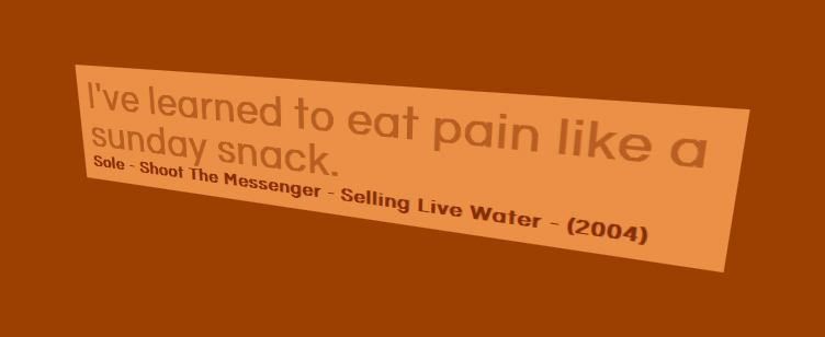
It should work really well on Safari, OK on Chrome, not-that-perfect on Firefox and poorly on Internet Explorer. You were looking for a reason to continue using Flash for building “experience sites”? There you have it: compatibility. Kwot JS relies on CSS3 transforms to allow this perspective view on quotes, and on property transitions to animate the quotes’ colors. Of course this doesn’t work in all browsers!

Now, about Backbone.js. The framework’s requirements and logic are good, but coming from an AS3 world mostly everything looks odd, for better or worse. Note this is my first project with it and I might have missed some good practices or handy tips.

The good thing is its persistence layer. In Kwot, quotes are stored in a database, I simply wrote a simple RESTful API with Slim (try this PHP framework: win) and connected it to my Model classes. That’s it, it just works. Underscore.js’ templating system is handsome, too. Never used that before, cool stuff.

The bad things are, as far as I’m concerned:

  • No strong typing. Of course this isn’t Backbone’s problem, but rather JS’ one. On this particular point your IDE can help, but you won’t get runtime errors.
  • The “this” keyword. You always end up with plenty of lines all starting with a “this.something”. It frustrates me.
  • Scope issues: when listening to events you pretty much always have to use Underscore.js’ bind method in order not to lose your infamous “this” scope. I don’t like that.
  • The MVC pattern. If you ask me: it sucks. I’m no integrist but I wouldn’t have called what Backbone provides MVC. I was always wondering “who should do that?” and never really came up with a satisfying answer.

Overall the learning curve is pretty steep, I think it took me less time to write this version than the Flash one, but I’m a 3 year more mature developer. Also, when I wrote the Flash version I didn’t really know where I was going and I kept experiencing with concepts and ideas to see what would look best.

On a side note the Flash version uses Neutra, whereas this one uses Questrial (hosted and served by Google Webfonts).

Tell me what you think, both about the app and the framework!

Generating a Windows installer for your AIR captive runtime application

I recently wrote a pretty big tutorial about Adobe AIR, its captive runtime mode, and how to generate a Windows installer on top of that. It was written in French and published on flex-tutorial.fr.

I then contacted the fine folks at Adobe Developer Connection and offered to translate it to English. They accepted, reviewed it, and boom: published it.

Wether you’re a French or English reader, I got you covered. Tell me what you think.

Shrink O’Matic 2

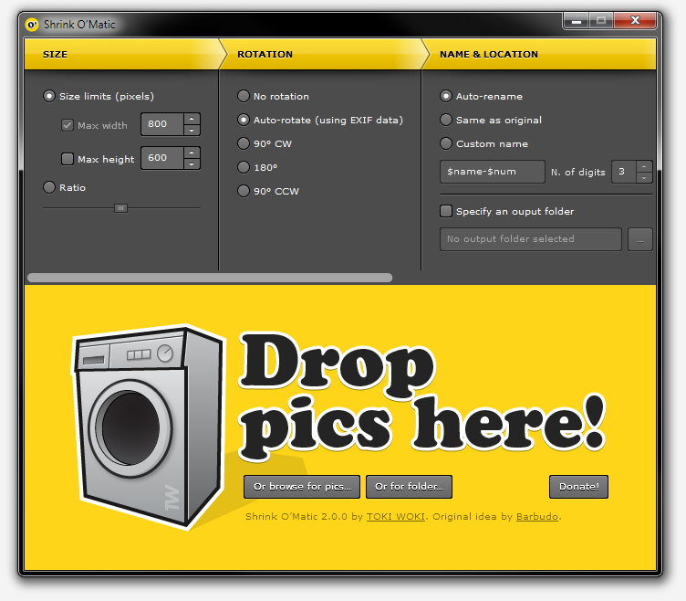
Back in 2008 I would spend some of my Saturday afternoons sitting in a Laundromat, waiting for my clothes to smell good. I quickly realized these moments were perfect to bring my laptop with me and code. One of the first AIR apps I wrote was Shrink O’Matic, now you know where the name comes from.

It quickly became successful. It now has been downloaded 168,000+ times, a best-seller of sorts. Except it’s free.

But with success comes feedback, and with feedback comes feature suggestions. Most of them were included through updates, some of them didn’t make the cut. Probably because of me being lazy or because of AIR’s limitations.

Then AIR 2 came out, then I learnt Robotlegs… So I re-wrote it from scratch! Introducing Shrink O’Matic 2, the same quick and simple app but with more features and a nicer theme.

Here’s what’s fresh off the oven:

  • Drop folders onto the app: every image in it (or in its sub-folders) will be shrinked.
  • New “Rotation” settings pane: either use a specific angle or let the app read your images’ EXIF data and decide what to do.
  • Custom name option: choose exactly what the output name will be using your own pattern and injecting the original file’s name (using $name) and/or its position in the queue (using $num).
  • PNG files now keep their transparency when shrinked.
  • Watermark: watermark your images, even choose where to place the overlay.
  • Drop files onto the app while it’s processing, no problemo!
  • No more dimension limits.
  • Shiny new theme!

But! I decided some features had to go. I removed the “name preview” that used to be in the status bar. I also removed the ability to drop images from web pages. If you need these features and want them back, make sure to drop a comment and let me know!

That’s it, go get it!

W-Architectures

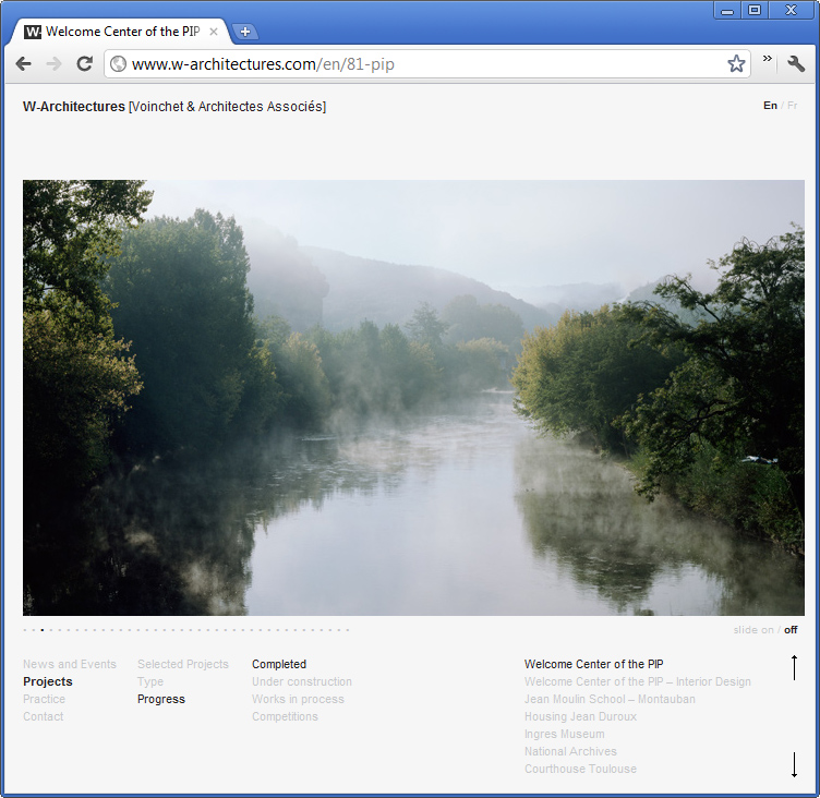
“W-Architectures is an architecture and urban-planning agency. The firm brings together a highly-qualified team of architects with international experience.” This is how they introduce themselves and I couldn’t have said it better myself.

I recently published their brand new website, designed by Christelle Bonnet and developed by me. It’s been a pretty long process (they are very busy guys) but it’s here and I like it!

I used mostly WordPress and MooTools to develop it. Everything was designed to be light and subtle, I think I can safely say that it is.

MSK view, for iOS and Android

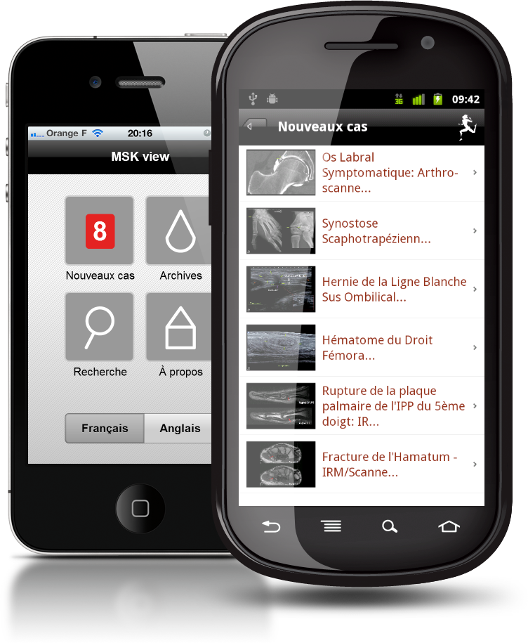
I’ve been working on an app for a French sport hospital, designed to browse its msk image library. It’s called “MSK view” and it is available for free in iTunes (iPhone and iPad version) and in the Android Market.

Pretty technical stuff in it, not sure everyone will want to install it but hey, there may be some doctors out there!

The hospital is French but the app is both in French and English. Built in Flash Builder with Flex Mobile, Robotlegs and AMFPHP, UI design by Jumo.

Now go show off browsing images of “Scaphotrapezial Synostosis” or “Rectus Femoris intramuscular Haematoma”, whatever it may be!

Boks is now OpenSource

Boks is one of my most successful apps and this is probably not only because of its usefulness, but also because it is free, too. I released it more than 2 years ago and it is still heavily downloaded.

The CSS community is really active and fast-moving. When I wrote Boks, Blueprint CSS was one of the most watched and forked project on GitHub which is mostly why I chose to base my UI and logic on it (it still is at the top, by the way). But with today’s CSS3 hype and because of the ever-growing list of CSS frameworks (not going to list them here) I started receiving lots of feature requests.

At first I thought I could wait and handle them later, but I quickly realized it would need a lot of time, and I definitively didn’t have it in my hands (or at least not for this project). The idea to OpenSource it seemed obvious and I’ve been slow doing so, but here it is. If anyone’s willing to take a look at what I wrote and fix or improve it, do it! Don’t forget that this has been written a while back and I wouldn’t re-write it this way (think Robotlegs); I know the code will look crappy to some but hey, we all learn and evolve, right?

I’ve licensed Boks’ source under GNU GPL v3 in order for it to remain OpenSource, but if you have other suggestions, just tell me.

Signl – A Custom AS3 Signal File Generator

Remember Evnt, the quick and simple UI to generate AS3 Event subclasses?

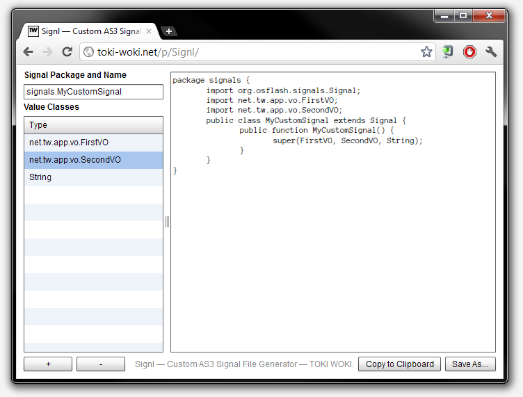
Well, it’s still here but I don’t use it much anymore, since I’m a big fan of Robert Penner‘s Signals! So I wrote Signl. It’s basically the same thing, but for Signals.

I know writing Signal classes is an easy task; but, why not make it easier? I hope this helps! Oh, and by the way, it’s OpenSource, just like Evnt was.

La Classe Américaine – Android

Hey, fellow english-reading visitor, this post is going to be in French! Hope you don’t mind.

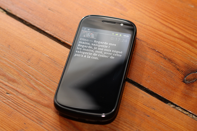
Si comme moi vous ne pouvez pas vous empêcher de dire “flim”, “ouiche” ou encore “un pour l’argent, deux pour le spectacle et trois pour le caillou”, cette application est pour vous.

Après une semaine de vacances avec une personne touchée par cette maladie et sans avoir accès à Internet j’ai vite réalisé qu’il me fallait une application contenant tout le script de ce magnifique flim : La Classe Américaine. Je savais qu’un fou avait déjà fait tout le sale boulot et qu’il ne me restait plus qu’à extraire ces données et créer l’interface pour les parcourir…

Grâce à Google Chrome et ses Outils de développement j’ai pu injecter MooTools dans la page. Petite astuce très simple et très pratique (script à copier/coller dans la console) :

var scriptNode = document.createElement('SCRIPT');
scriptNode.type = 'text/javascript';
scriptNode.src = 'https://ajax.googleapis.com/ajax/libs/mootools/1.3.2/mootools-yui-compressed.js';
var headNode = document.getElementsByTagName('HEAD');
if (headNode[0] != null) headNode[0].appendChild(scriptNode);

Après ça, quelques lignes pour extraire les données, les nettoyer et les stocker directement dans le presse-papier au format JSON :

var data=[];
var images=$$('table.script img');
for (var i=0; i\n$/, '')
    });
}
console.log(data.length);
copy(JSON.encode(data));

Un petit coup de Flash Builder, saupoudré de Robotlegs et hop, une appli Android ! Pas de version iPhone pour l’instant, mais si quelqu’on m’offre de quoi me payer un certificat de développeur, je ne dis pas non !

Au revoir, Messieurs-Dames. C’est ça, la puissance intellectuelle. Bac + 2, les enfants.