A few days back a very simple idea struck me right before going to bed. The more I thought about it, the less I could sleep. The day after this short night I fired up Photoshop and started writing a little bit of JavaScript. All this led to Fluid Corners.

The idea is pretty simple but could come in handy: when your OS’s windows are moved off-screen, their essentials UI elements (think: buttons) stay at reach, sticking to the screen’s limit. Go ahead and play with the demo, you’ll get it!
Thoughts welcome, of course.
ps 1: A hot thread about it on Hacker News.
ps 2: @raphaelbastide‘s take on the idea: greasy!
Boks is one of my most successful apps and this is probably not only because of its usefulness, but also because it is free, too. I released it more than 2 years ago and it is still heavily downloaded.
The CSS community is really active and fast-moving. When I wrote Boks, Blueprint CSS was one of the most watched and forked project on GitHub which is mostly why I chose to base my UI and logic on it (it still is at the top, by the way). But with today’s CSS3 hype and because of the ever-growing list of CSS frameworks (not going to list them here) I started receiving lots of feature requests.
At first I thought I could wait and handle them later, but I quickly realized it would need a lot of time, and I definitively didn’t have it in my hands (or at least not for this project). The idea to OpenSource it seemed obvious and I’ve been slow doing so, but here it is. If anyone’s willing to take a look at what I wrote and fix or improve it, do it! Don’t forget that this has been written a while back and I wouldn’t re-write it this way (think Robotlegs); I know the code will look crappy to some but hey, we all learn and evolve, right?
I’ve licensed Boks’ source under GNU GPL v3 in order for it to remain OpenSource, but if you have other suggestions, just tell me.
Posted on July 25, 2011 under Dev.
This post is tagged air, as, flex, opensource, ui and has Comments Off on Boks is now OpenSource.
[iframe src=”http://toki-woki.net/p/golden-ratio/”]
I wrote a quick and simple golden ratio tool (dedicated page). Basically it helps you find “golden ratio neighbors” for a given number: every number in the list divided/multiplied by its neighbor = φ.
Pretty straightforward but could come in handy. I’m aware it could be improved; if you have suggestions…
Posted on November 11, 2010 under Dev,Visual.
This post is tagged as, flex, font, typo, ui and has Comments Off on A Golden Ratio Tool.
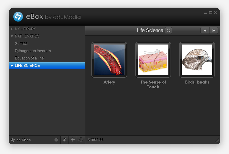
Guess what? AIR app! This one’s for eduMedia.
An intro
We create and distribute pedagogical simulations and videos, and our school users can download them to prepare and illustrate their lessons. Until now we offered server-side generated ZIP files with an HTML, some CSS and the SWF, but users (who often are not computer geeks) wanted something simpler and more powerful… So we designed the eBox!
The eBox
Basically the eBox is an empty media library waiting to be filled. The first time you launch it, it installs itself (and the AIR runtime, if not already there) and then fills itself with the medias you chose. This happens thanks to AIR’s BrowserInvoke logic and removes the “Save As” and “Uncompress” steps.

You can also fill it with “local medias” (of any type) but dragging and dropping files on it, or by browsing and selecting them. If these medias are SWFs they’ll be opened within the app, if not the OS will open them with their default app. Handy.
You also have the ability to create directories to organize your library, and to reorder medias (via drag and drop). Pretty common, but cool.
Let’s talk tech
Flex 4.1, localized with Lupo (now free and OpenSource!) and designed with Illustrator. Server-side communication is made through AMFPHP. I used some tiny techniques that helped deploy two different versions with only one project (we have a school and an individual version), I might detail that in a next post.
This is my first real-life project with Robotlegs, it helped me learn how to use it and how to write really clean code; with view, mediators and all. I loved it and think I will continue building big projects with RLs, makes you feel pretty.
So?
I’m pretty happy with the final result (not that final, expect updates!), both on visual and technical points of view. Go grab a free media and tell me what you think! We also set up a special page with a nice presentation of how it works, in case you’re lost.
Meet Dok, my latest and nicest AIR app to this day!

Always looking for help when writing AS3 for Flash, Flex and AIR? Think Adobe’s reference is rich but browsing it sucks? Well, I did too. So I wrote this little thingy that loads, parses and caches help pages and then presents them in a slick and quick UI!
Since this app is only intended for devs and therefore may not be very interesting to others, I decided it should look good. So I tried my best and worked hard on those pixels and styles (colors and textures inspired by that sweet clock)… Jump to the project page for life-size screenshot!
This project is absolutely OpenSource, from top to bottom. AS3 classes, MXML, Illustrator and Photoshop files, PNGs and so on… Help yourself.
Posted on May 25, 2010 under Dev,Visual.
This post is tagged air, as, flash, flex, gray, illustrator, opensource, photoshop, ui and has 4 comments.

Introducing Boks, my latest and most ambitious AIR app to this day!
Do you design web pages? Do you write HTML and CSS? Ever heard about the Grid System and Blueprint CSS? Thought it was a pain to implement? Think again, fool!
Boks is some kind of WYSIWYG to help you setup a grid and baseline rhythm, build and fill your layout and export all this to HTML and CSS in no time.
Got your own CSS style already? No problemo, Boks can use them and eventually merge and compress them within a single “screen.css”. Your styles use images? Simply point to your asset directory and it will be included too! Afraid of breaking the baseline rhythm with you randomly sized images? Just select the “Add JS to fix baselines” option and you’re good to go!
Enough. Just go grab it (or just have a look at the lovely screenshots) and send feedback!
Apr 01, 2009: Update! I’ve done some wacky video screencasts that can help you understand everything about Boks, go and have a look! Yes, the sound is not perfect.
Posted on March 29, 2009 under Dev,Visual.
This post is tagged air, flex, grid, illustrator, javascript, logo, typo, ui, white and has 291 comments.

A new project is online! It’s called Kwot, and it allows you to share and store your favorite quotes.
The UI is quite minimalistic, with focus on simplicity. Navigate through quotes with your mouse wheel, your keyboard’s left and right arrow or the mini timeline at the bottom. Add a quote by clicking on the plus button at the bottom right hand corner. If you don’t pick any color they’ll be automatically chosen via a magic algorithm! Another magic algorithm will rotate your quote in 3D space. But don’t worry you will preview that in real-time, ha!
I might add user (login) support, language tagging, an RSS feed and stuff like that but don’t expect that too soon, holidays are coming!
If you don’t have the Flash plugin or if you visit the site on an iPhone the site will look quite different but everything will remain!
A few things I used in case you wonder: swfaddress (you will love deep-linking!), GTween, FlashDevelop, AMFPHP, the viewport width attribute… Oh, and by the way, the font face is called Neutra.
Add some quotes and drop feedback!

