This is a 2010-to-2013 archive of toki-woki.net. Here's how it looks now.

Unipasta, a Unicode browser

When writing in French I’m always looking for characters that can’t be easily typed with a keyboard (like œ, for example). I used to go to copypastecharacter.com for its simplicity: just go to that page, click on a character and boom, it’s in your clipboard, ready to be pasted!

But I wanted something more powerful/thorough that would remember my frequently used characters. So I wrote Unipasta!

Unipasta

Here’s what you should know about it:

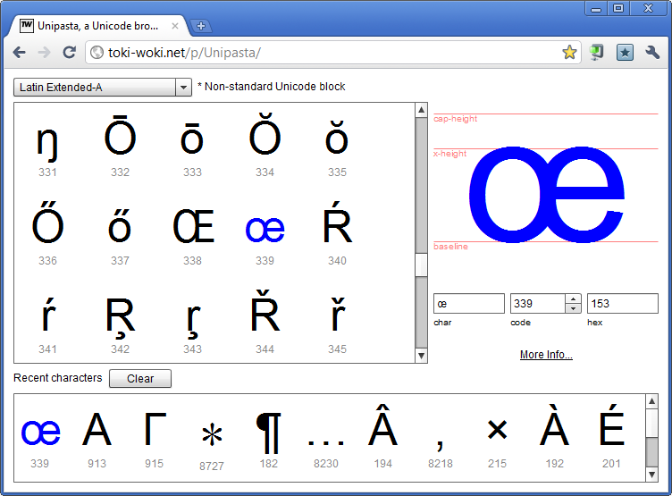
  1. Every input under the selected character (char, code and hex) can be edited and will update each other. Easily jump to any character!
  2. The font metrics (baseline, x-height and cap-height) are auto-calculated and will help you know where the char lives;
  3. Click on the “More Info” link to jump to fileformat.info and access a lot of details about the selected character;
  4. Every character your click will be automatically copied to your clipboard, handy!
  5. Use the “Recent characters” list to quickly access your favorite ones (latest used will always be listed first).

If you think some missing Unicode blocks are important to you or if you’d like to add a new character listing, just ask for it!

Five years of Google Talk history

My “anniversary” intro

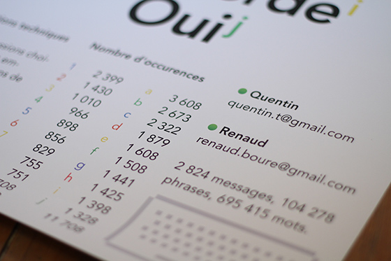
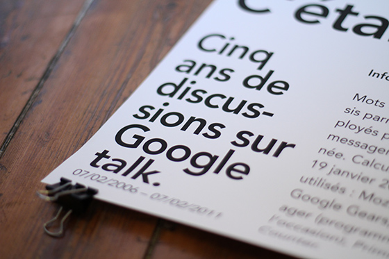
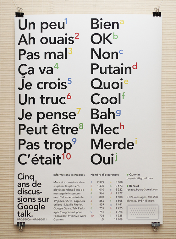
It’s been five years (this monday) since Google added the ability to simply chat inside Gmail and to store your chat history, just like your regular e-mail discussions. This poster is a celebration of that, plus a big high-five to my “chat pal” (who hopefully received my package on time), plus a technical and aesthetical look at what we wrote during these years.

Let’s make history

Back to the chat history thing… I remember being pretty happy when Google announced it, mainly because I knew I’d use it for later reference, archiving links and thoughts had become much easier.

Here’s a copy of the announcement they made:

Chat with your friends from right inside Gmail. There’s no need to load a separate program or look up new addresses. It’s just one click to chat with the people you already email, as well as anyone on the Google Talk network. And now you can even save and search for chats in your Gmail account.

So it’s been five years. And I’ve chatted quite a lot; mainly with one guy, my buddy Renaud. We chatted around 2,800 different discussions so I thought there might be some interesting data to dig in these archives… So I dug.

But digging thousands of discussions is not an easy task, so I had to take a look on the tech side of things.

Join the tech side of the force

Before digging, I had to retrieve all the discussions we had, in an easy-to-analyse format. I used Gmail’s offline feature: applying a new label to our conversations and locally syncing this label. For some unknown reason it would crash on Google Chrome so I had to use Mozilla Firefox. When syncing was done I got a pretty big file in my “Google Gears for Firefox” directory.

Cool thing is, Google Gears stores data as SQLite databases, so I fired up Lita in order to understand what the structure was like… Things looked a bit messy but I eventually found everything that would interest me; and it was in the “MessagesFT_content” table. Here’s the query I ran:

SELECT c1Body FROM MessagesFT_content WHERE c0Subject LIKE '%Chat%'

Almost cool. The query still returned a bunch of HTML code, our names, and other useless crap. So I fired up Flash Builder, imported the SQLite file and wrote a few AS3 lines, in order to grab the results and filter them with regular expressions. Bang: plain text! Oh, this useless AIR app is OpenSource, by the way.

Now that the data was clean and ready to be analyzed I had to find a cheap or free way to do it. I chose Primitive Word Counter, not because it’s perfect but rather because it’s very simple and could handle the large amount of data I was going to feed it (some other apps simply crashed)…

Running it gave me the most used words and phrases, I only picked the most interesting (at least to me) and launched InDesign.

A celebration poster

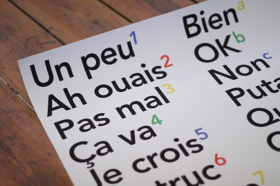
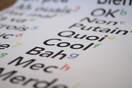
I decided to go for an A1 poster, mostly focused on those words and phrases but with a tech twist to it. I kept it all secret, got it printed, and sent it to my pal… Happy fifth Google-talk-history-enabled anniversary to him; and to all of you out there that use it on a daily basis!
A Golden Ratio Tool

[iframe src=”http://toki-woki.net/p/golden-ratio/”]

I wrote a quick and simple golden ratio tool (dedicated page). Basically it helps you find “golden ratio neighbors” for a given number: every number in the list divided/multiplied by its neighbor = φ.

Pretty straightforward but could come in handy. I’m aware it could be improved; if you have suggestions…

Hey! – A Lego Table

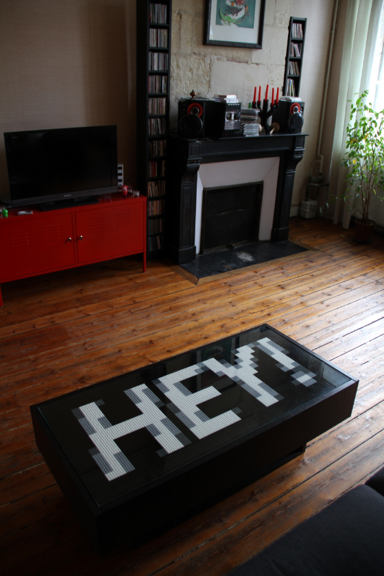
When I moved in I bought an IKEA Ramvik table and while travelling this summer I had an idea (don’t ask why): decorate its top with Lego bricks used as pixels. Here are the steps I went through. If you don’t care about those steps and want to see a nice time-lapse video, scroll to the end of the article!

Lego bricks

First things first. What are the Lego brick sizes and colors available? Oddly enough this question is not that easily answered. Probably because Lego’s site is crappy, or because nobody really cares… I eventually found Brickipedia which happens to be a much richer resource than the official ones. Everything I was looking for was there: the Lego “unit” is 8 millimeters and the color palette is pretty simple.

Table specs

Knowing my table size I had various options, depending on the “pixel size” I’d choose. Of course the number of bricks (and the price) would also vary. So I created a dynamic spreadsheet on Google Docs that’d do the calculations for me… Here it is, with all the options possible (French, sorry).

[iframe src=”https://spreadsheets.google.com/pub?key=0AmyvU-n2aOBpdG5oNUN6UW0xcUJ4a2E3eXFrTTJIVnc&hl=en&output=html&widget=true” height=”374″]

I chose the 4×4 option, quite cheap and still offering a cool number of pixels.

Design

36×16 pixels of freedom, that’s it. I tried lots of different designs, from lo-fi photos to pixel-art drawings. I decided to go for a Heavy Oblique Futura.

Actual size:

Looking good.

The Lego palette

I set my type to white, on a black background. The anti-aliasing process creates gray-scale pixels to smooth the curves, which is great, but Lego bricks aren’t available in all colors! To have a realistic preview of what it would look like I had to create a Photoshop Color Table matching Lego’s gray-scales (if you’re interested, just ping me [UPDATE: here they are]). Here’s a comparison between Photoshop’s default gray-scales (left) and Lego’s palette (right):


You may notice that Lego’s black is a little bit light and the grays are yellowish.

Time to order bricks!

Already? Nope, not that fast. Before ordering I had to know exactly what to order, that means counting the pixels. Well, I’m not this kind of guy. I’m a developer; I hate repetitive chores, you know.

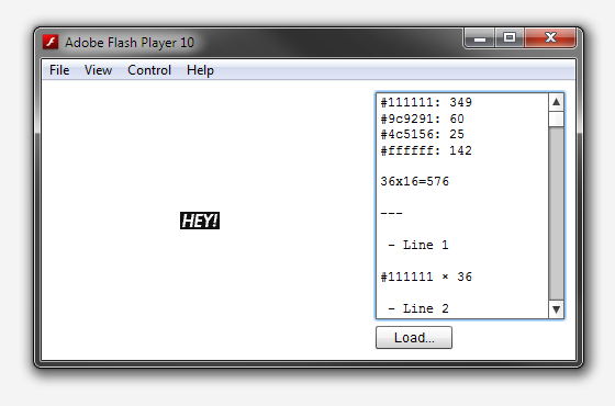
So I fired up Flash Builder and came up with PaletteCounter a simple, OpenSource, app to count pixels of each color. I also added some kind of “assembly instructions generator” to help us build it. Handy.

Time to order!

Really? Yup. I placed an order on lego.com’s Pick A Brick and received it a couple of weeks later. Yay!

Let’s do this

I’m not going to describe the process (that happened this saturday), just have a look at this time-lapse vid. 1020 pics shot in about an hour, yummy. Thanks to Céline and Julie for helping out!

[vimeo id=”16376065″ height=”374″]

This page has been translated in Russian by Karina.

Buck 65/20th

I’m still having a hard time believing what I’m about to write, but hopefully you will.

That was my intro, buddy.

A little bit of context

I listen to music, I try as hard as I can to be eclectic but let me confess that: I’ve always loved Hip-Hop. Of course my Hip-Hop heroes have changed through the years, but there’s one that never left my inner podium… He’s Canadian, he’s weird (proof: he’s worn a platypus shirt, once), he’s probably the most subtle writer I know (OK, with Yoni Wolf) and he’s evolving.

He’s Buck 65.

An ounce of Twitter

As in every web tale, it all starts with a Twitter status. Mine started with this one:

I kinda need a logo-thing made of the numbers 65 and 20. Anyone wanna take a crack? Who knows what might happen?!

I read this and thought “Well yes, but I’m kind of busy you know. And what the hell could I do with those damn numbers? Plus, lots of fans will answer that”.

Some friendly advice

A few days later as I was chatting with a good friend of mine (and discreetly sent him the link to that tweet) he reacted something like: “You bitch-ass cunt, you could try something and see! Stupid-ass jerk”. “Hum, well yeah, you know. Just sayin’…” I kind of replied.

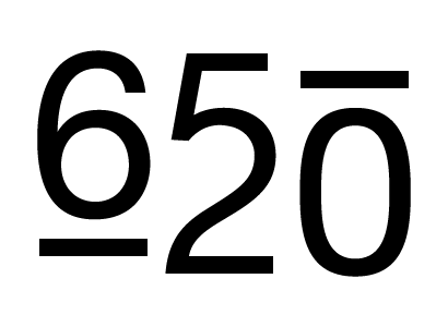
So I fired Illustrator and tried a few things out. A “65”, a “20”, and 15 minutes later I had something.

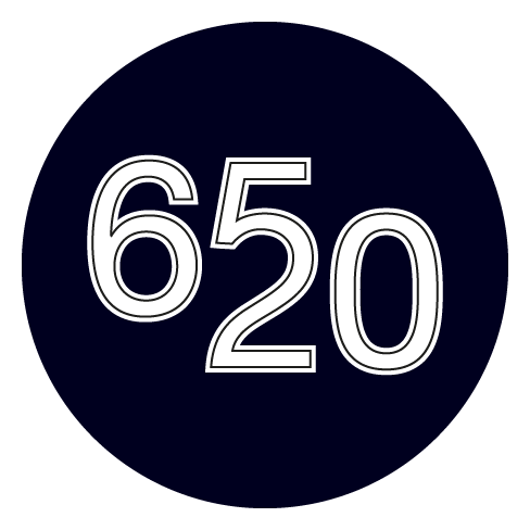
Not quite ready for prime-time, but the concept was there. A few iterations later I was kind of happy with this:

So I tweeted back.

Who knows what might happen

And got an answer, a private one. Saying he was liking it… Oh boy.

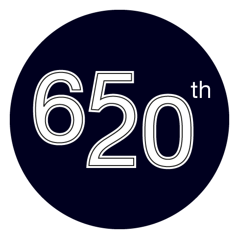
A few days later I received another private message asking me if I could add a “th” to the logo, letting me know the mysterious logo was in fact for his “20 years as a rap weirdo”. Which I (of course) did.

We then e-mailed back and forth and “sorted out the details”, he “blew [the logo] up with dynamite and shot it with a gun a few times” and that was it.

Oh boy

I made Buck 65’s 20th “year in the game” logo, which is up on his new website.

Call me a happy fan. Yup.

Boks–A Visual Grid Editor

Introducing Boks, my latest and most ambitious AIR app to this day!

Do you design web pages? Do you write HTML and CSS? Ever heard about the Grid System and Blueprint CSS? Thought it was a pain to implement? Think again, fool!

Boks is some kind of WYSIWYG to help you setup a grid and baseline rhythm, build and fill your layout and export all this to HTML and CSS in no time.

Got your own CSS style already? No problemo, Boks can use them and eventually merge and compress them within a single “screen.css”. Your styles use images? Simply point to your asset directory and it will be included too! Afraid of breaking the baseline rhythm with you randomly sized images? Just select the “Add JS to fix baselines” option and you’re good to go!

Enough. Just go grab it (or just have a look at the lovely screenshots) and send feedback!

Apr 01, 2009: Update! I’ve done some wacky video screencasts that can help you understand everything about Boks, go and have a look! Yes, the sound is not perfect.

Kwot

A new project is online! It’s called Kwot, and it allows you to share and store your favorite quotes.

The UI is quite minimalistic, with focus on simplicity. Navigate through quotes with your mouse wheel, your keyboard’s left and right arrow or the mini timeline at the bottom. Add a quote by clicking on the plus button at the bottom right hand corner. If you don’t pick any color they’ll be automatically chosen via a magic algorithm! Another magic algorithm will rotate your quote in 3D space. But don’t worry you will preview that in real-time, ha!

I might add user (login) support, language tagging, an RSS feed and stuff like that but don’t expect that too soon, holidays are coming!

If you don’t have the Flash plugin or if you visit the site on an iPhone the site will look quite different but everything will remain!

A few things I used in case you wonder: swfaddress (you will love deep-linking!), GTween, FlashDevelop, AMFPHP, the viewport width attribute… Oh, and by the way, the font face is called Neutra.

Add some quotes and drop feedback!