I just launched a Tumblr about the font creation process I recently started. Should be interesting to anyone loving fonts as I will study some of their aspects and be as visual as I can. Should be.
Okr – Story of a failure
Some projects become real, others never see the light of day. This one is more of an abortion.
Six month ago I’ve been contacted by an architectural firm to provide some consulting on a project of theirs (I’m not going to name names, you’ll understand why). The goal was to find ideas to make a building’s front more interesting. The building being a place to help and promote Hip-Hop culture.
So I started working on it and came up with ideas and concepts. The architect I was in contact with seemed pretty happy with it and everything was looking good.
Until I no longer received any answer to my e-mails… Our last interaction is now 5 month old and I think time has come to mourn. What I came up with can be interesting and since it involves an OpenSource project, here are a few bits about it.
At that time I was discovering GML (Graffiti Markup Language) and Evan Roth‘s work. Bordeaux hosted Les Grandes Traversées and all of this really inspired me. So I thought of a mash-up between GML’s #000000book (black book, open archive of GML tags), a player of my own (Okr), the building itself and Twitter. Here’s the document I presented to explain what I had in mind.
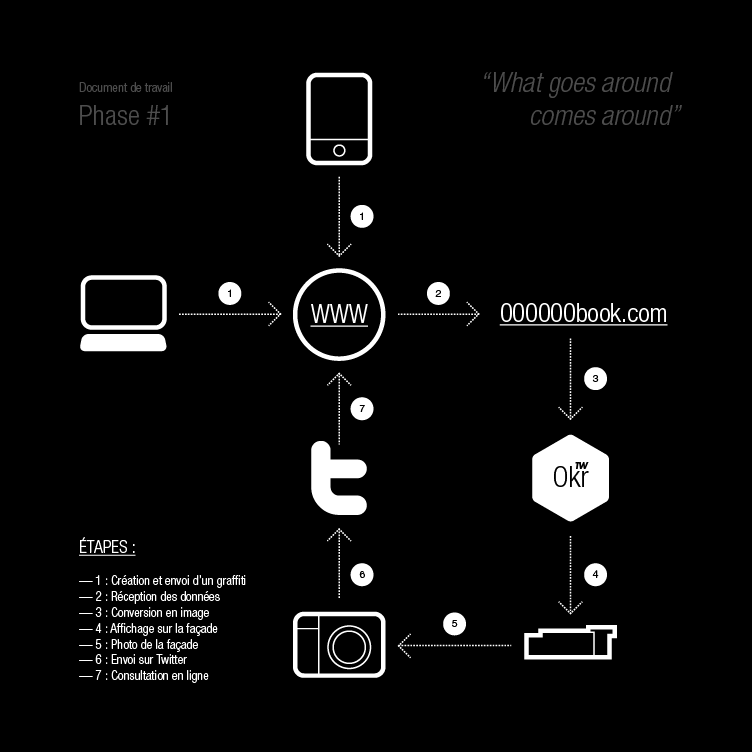
The steps are:
- Creating and sending a graffiti;
- Receiving data;
- Converting it to an image;
- Projecting it on the building’s front;
- Photo-shooting of the front;
- Sending to Twitter;
- Online consultation.
After a few e-mails with Jamie Wilkinson (heads up!) I started working on the core classes writing GMLPlayer and GMLCreator. The goal was to provide both a way to display tags and to create/upload them. I then built a UI around all that (a Flex one, after noticing Minimal Comps didn’t work the way I expected).
[iframe src=”http://toki-woki.net/p/Okr/” width=”752″ height=”506″]
Note: you’ll also find the app on its dedicated page. Try searching for “dasp” or “hello world” for example and play with the settings (the 3 top sliders).
Unfortunately it is only after creating all this that I realized the project would never become real… So I simply stopped working on it. I am well aware that some parts of the code is a bit raw and could be optimized and I haven’t built the creation/upload feature into the UI yet. Don’t know if I will, but the project is OpenSource so feel free to give it a spin! I also share my initial attempt and a pixel version in case you’re interested.
Pretty happy that — even if not feature complete — Okr made it to the GML project gallery, yay!
And just because a project will never see the light of day doesn’t mean it doesn’t need a proper logo, right?

SVG to RaphaelJS
While redesigning this blog I wanted to keep the “one color per post” concept I had in the previous version by changing (tweening) the logo’s color accordingly to the article being viewed (or scrolled to). I rapidly realized I couldn’t achieve this with just HTML+CS+JS and I didn’t want to use Flash (mainly because of iOS devices but also to avoid loading a SWF file on every page).
I remembered hearing — a few months earlier — about Raphaël (a JS lib to render vector graphics). At that time I found the concept really interesting but couldn’t see where to use it.
OK, so I know what I want to do, I know the tools I’ll use, but how do we do that? Raphaël is cool, but its syntax looks a bit cryptic at first. It says it handles SVG, and — guess what — Illustrator can export to SVG. We’re getting closer…
SVG is XML, but Raphaël doesn’t eat XML, it eats a specific syntax meant to be compatible with SVG and VML. Hum… This is when I fire Flash Builder and start writing code. The goal: accept an SVG XML file as input and spit some “Raphaël-compatible script” out.
Boom (plus a little demo of an output).
I then simply had to export my Ai logo to SVG, open it in SVG2RaphaelJS, copy paste the output, and wire all that to the scroll/color tweening logic. Pretty easy.
Everything worked and looked nice on all browsers and OS’s but I realized the sole idea of having a logo changing colors didn’t work that well. For purely visual reasons. So I dropped it from my theme and rolled back to the black PNG version you can see right now.
The good thing is, the tool works pretty well (at least with Illustrator SVGs) and is OpenSource. Either use it or modify it, and tell me what you think. I did this in a hasty fashion and I probably won’t use it a lot, so don’t expect updates or bug fixes… But if you feel like improving it, please do so!
eduMedia’s eBox
Guess what? AIR app! This one’s for eduMedia.
An intro
We create and distribute pedagogical simulations and videos, and our school users can download them to prepare and illustrate their lessons. Until now we offered server-side generated ZIP files with an HTML, some CSS and the SWF, but users (who often are not computer geeks) wanted something simpler and more powerful… So we designed the eBox!
The eBox
Basically the eBox is an empty media library waiting to be filled. The first time you launch it, it installs itself (and the AIR runtime, if not already there) and then fills itself with the medias you chose. This happens thanks to AIR’s BrowserInvoke logic and removes the “Save As” and “Uncompress” steps.
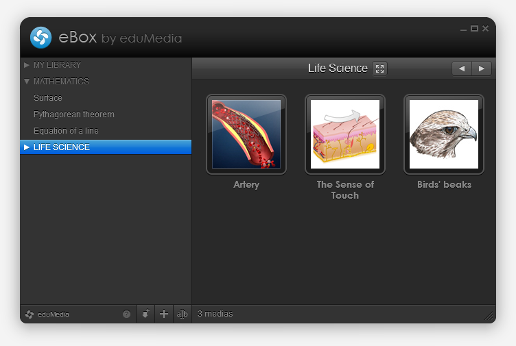
You can also fill it with “local medias” (of any type) but dragging and dropping files on it, or by browsing and selecting them. If these medias are SWFs they’ll be opened within the app, if not the OS will open them with their default app. Handy.
You also have the ability to create directories to organize your library, and to reorder medias (via drag and drop). Pretty common, but cool.
Let’s talk tech
Flex 4.1, localized with Lupo (now free and OpenSource!) and designed with Illustrator. Server-side communication is made through AMFPHP. I used some tiny techniques that helped deploy two different versions with only one project (we have a school and an individual version), I might detail that in a next post.
This is my first real-life project with Robotlegs, it helped me learn how to use it and how to write really clean code; with view, mediators and all. I loved it and think I will continue building big projects with RLs, makes you feel pretty.
So?
I’m pretty happy with the final result (not that final, expect updates!), both on visual and technical points of view. Go grab a free media and tell me what you think! We also set up a special page with a nice presentation of how it works, in case you’re lost.
Buck 65/20th
I’m still having a hard time believing what I’m about to write, but hopefully you will.
That was my intro, buddy.
A little bit of context
I listen to music, I try as hard as I can to be eclectic but let me confess that: I’ve always loved Hip-Hop. Of course my Hip-Hop heroes have changed through the years, but there’s one that never left my inner podium… He’s Canadian, he’s weird (proof: he’s worn a platypus shirt, once), he’s probably the most subtle writer I know (OK, with Yoni Wolf) and he’s evolving.
He’s Buck 65.
An ounce of Twitter
As in every web tale, it all starts with a Twitter status. Mine started with this one:
I kinda need a logo-thing made of the numbers 65 and 20. Anyone wanna take a crack? Who knows what might happen?!
I read this and thought “Well yes, but I’m kind of busy you know. And what the hell could I do with those damn numbers? Plus, lots of fans will answer that”.
Some friendly advice
A few days later as I was chatting with a good friend of mine (and discreetly sent him the link to that tweet) he reacted something like: “You bitch-ass cunt, you could try something and see! Stupid-ass jerk”. “Hum, well yeah, you know. Just sayin’…” I kind of replied.
So I fired Illustrator and tried a few things out. A “65”, a “20”, and 15 minutes later I had something.
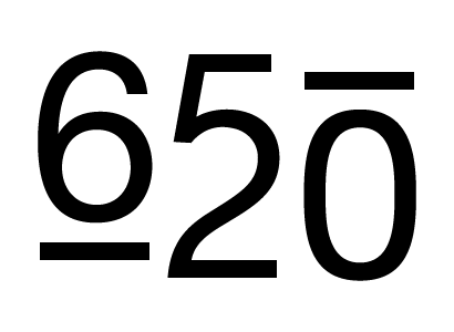
Not quite ready for prime-time, but the concept was there. A few iterations later I was kind of happy with this:
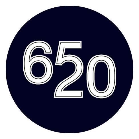
So I tweeted back.
Who knows what might happen
And got an answer, a private one. Saying he was liking it… Oh boy.
A few days later I received another private message asking me if I could add a “th” to the logo, letting me know the mysterious logo was in fact for his “20 years as a rap weirdo”. Which I (of course) did.
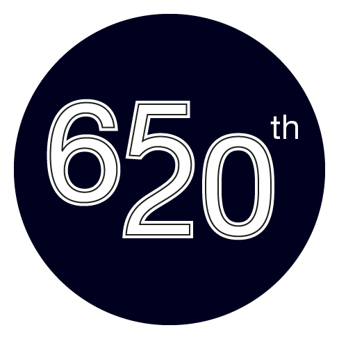
We then e-mailed back and forth and “sorted out the details”, he “blew [the logo] up with dynamite and shot it with a gun a few times” and that was it.
Oh boy
I made Buck 65’s 20th “year in the game” logo, which is up on his new website.
Call me a happy fan. Yup.
Dok — AS3 Doc. UI
Meet Dok, my latest and nicest AIR app to this day!
Always looking for help when writing AS3 for Flash, Flex and AIR? Think Adobe’s reference is rich but browsing it sucks? Well, I did too. So I wrote this little thingy that loads, parses and caches help pages and then presents them in a slick and quick UI!
Since this app is only intended for devs and therefore may not be very interesting to others, I decided it should look good. So I tried my best and worked hard on those pixels and styles (colors and textures inspired by that sweet clock)… Jump to the project page for life-size screenshot!
This project is absolutely OpenSource, from top to bottom. AS3 classes, MXML, Illustrator and Photoshop files, PNGs and so on… Help yourself.
Shortcodes for Drupal
WordPress’ Shortcode API is a really cool thing, and since I’m working on a Drupal site these days I’ve been looking for something similar. Unfortunately I couldn’t find anything… There are some implementations out there but the ones I found and tested always come pre-bundled with specific tags and don’t always provide an extensible and stable logic.
So I made mine!
Most of my work simply consisted in copying/pasting the code in WordPress’ shortcodes.php and binding it into a Drupal filter. Easy enough.
Now if you want to use it, you have to:
- Get the module
- Add it to your “modules” directory
- Enable it
- Add it to one of your setup’s filter bundle
- Write your own module where you’d implement one or more Shortcodes (via add_shortcode) and make sure you add “dependencies[] = shortcodes” in your .info file
You might experience a nasty “Call to undefined function add_shortcode“. If so, you have to change you module implementation’s weight, either directly in your database, or thanks to the cool Utility module. Set it to 10 and you’re set!
Boks–A Visual Grid Editor
Introducing Boks, my latest and most ambitious AIR app to this day!
Do you design web pages? Do you write HTML and CSS? Ever heard about the Grid System and Blueprint CSS? Thought it was a pain to implement? Think again, fool!
Boks is some kind of WYSIWYG to help you setup a grid and baseline rhythm, build and fill your layout and export all this to HTML and CSS in no time.
Got your own CSS style already? No problemo, Boks can use them and eventually merge and compress them within a single “screen.css”. Your styles use images? Simply point to your asset directory and it will be included too! Afraid of breaking the baseline rhythm with you randomly sized images? Just select the “Add JS to fix baselines” option and you’re good to go!
Enough. Just go grab it (or just have a look at the lovely screenshots) and send feedback!
Apr 01, 2009: Update! I’ve done some wacky video screencasts that can help you understand everything about Boks, go and have a look! Yes, the sound is not perfect.
Kwot
A new project is online! It’s called Kwot, and it allows you to share and store your favorite quotes.
The UI is quite minimalistic, with focus on simplicity. Navigate through quotes with your mouse wheel, your keyboard’s left and right arrow or the mini timeline at the bottom. Add a quote by clicking on the plus button at the bottom right hand corner. If you don’t pick any color they’ll be automatically chosen via a magic algorithm! Another magic algorithm will rotate your quote in 3D space. But don’t worry you will preview that in real-time, ha!
I might add user (login) support, language tagging, an RSS feed and stuff like that but don’t expect that too soon, holidays are coming!
If you don’t have the Flash plugin or if you visit the site on an iPhone the site will look quite different but everything will remain!
A few things I used in case you wonder: swfaddress (you will love deep-linking!), GTween, FlashDevelop, AMFPHP, the viewport width attribute… Oh, and by the way, the font face is called Neutra.
Add some quotes and drop feedback!
FFFFOUND Desktop
Finally a new AIR app! It’s called FFFFOUND Desktop and if you like FFFFOUND you’ll love it.
More info on the projet’s page, as usual.
Just like the other AIR apps, it uses some home-brewed open-source utility classes, some of which have been updated for this project, go play with’em!
